Wear the Best Colors for Fall
Harvey Prince
- posted on
- No Comment
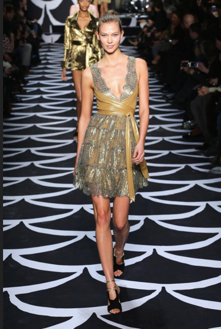
Mercedes Benz New York Fashion Week just wrapped up this month and like it or “don’t wanna wear it,” mesh was one of the big trends seen on the runways. One designer describes a particular two-tone mesh as “sporty and futuristic.” Which colors dominate the fall season?
Source: NY Daily News
Color Trends
Yellow showed up a lot during the recent NY Fashion Week. According to Pantone.com, design and color were inspired by everything from books, artisan crafts, photography and retro architecture, to exotic landscapes and the children of rock legends. The diverse color palette takes us on an adventure spanning 100 years—a season roused by various vantage points from past and present.
“This is a season of untypical colors—more reflective of the imagination and ingenuity, which makes for an artful collection of colors and combinations not bound by the usual hues for fall,” says Leatrice Eiseman, executive director of the Pantone Color Institute®. “There is a feminine mystique that is reflected throughout the palette, inspired by the increasing need for women everywhere to create an individual imprint.”
Pantone’s Fall 2014 Top 10 Women’s Colors
Sangria, an exotic red that evokes a sense of glamorous adventures and faraway destinations is enhanced by Aurora Red, a more sophisticated shade that adds verve and spark.
The grown-up reds are followed by two extremes of the purple family that intrigue the eye and inspire the imagination. Mauve Mist, a romantic and elegant purple shade, reminds us of the deco era and stimulates a sense of femininity and empowerment, while Radiant Orchid, a captivating and adaptable shade, enchants the complete spectrum. Pair either with Cypress, a majestic and powerful green; indicative of its name, this shade has a towering presence and serves as a stunning perennial.
With its slightly green undertone, Bright Cobalt offers a subtle twist on the traditional cobalt blue, which unifies this season’s blues. Likewise, Royal Blue, which is both evocative and dignified, provides more complexity and excitement than the average navy, while still remaining versatile. Pair Bright Cobalt with Sangria and Cypress, or Royal Blue with Mauve Mist and Aluminum, a futuristic stainless steel shade that serves as a complex neutral.
Similar to Sangria, Cognac’s name alone leads to glamorous illusions. This classy and cultured brown takes a typical autumnal color to a sumptuous realm, making the shade unexpectedly ideal for evening wear. Adding a ray of sunlight and warmth, optimistic Misted Yellow alludes to the promise of spring to come. Both Cognac and Misted Yellow will also be prevalent in prints—a surprisingly popular trend this fall season.
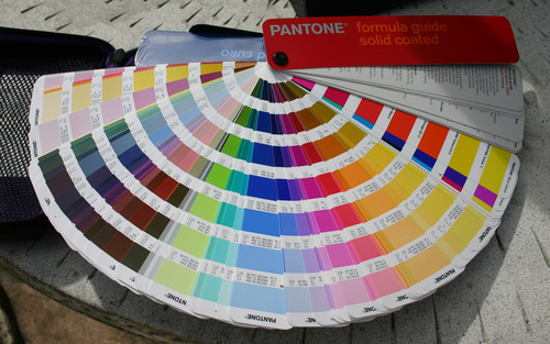
About Pantone
Pantone is the world-renowned authority on color. Every year the company announces its choice for Color of the Year. The color of the year selection is a very thoughtful process. To arrive at the selection, Pantone quite literally combs the world looking for color influences. This can include the entertainment industry and films that are in production, traveling art collections, hot new artists, popular travel destinations and other socio-economic conditions.
Influences may also stem from technology, availability of new textures and effects that impact color, and even upcoming sports events that capture worldwide attention.
For more than a decade, Pantone’s Color of the Year has influenced product development and purchasing decisions in multiple industries, including fashion, home and industrial design, as well as product packaging and graphic design